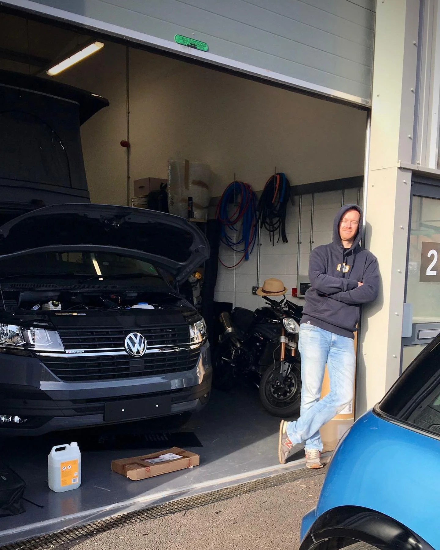
JMH Workshop
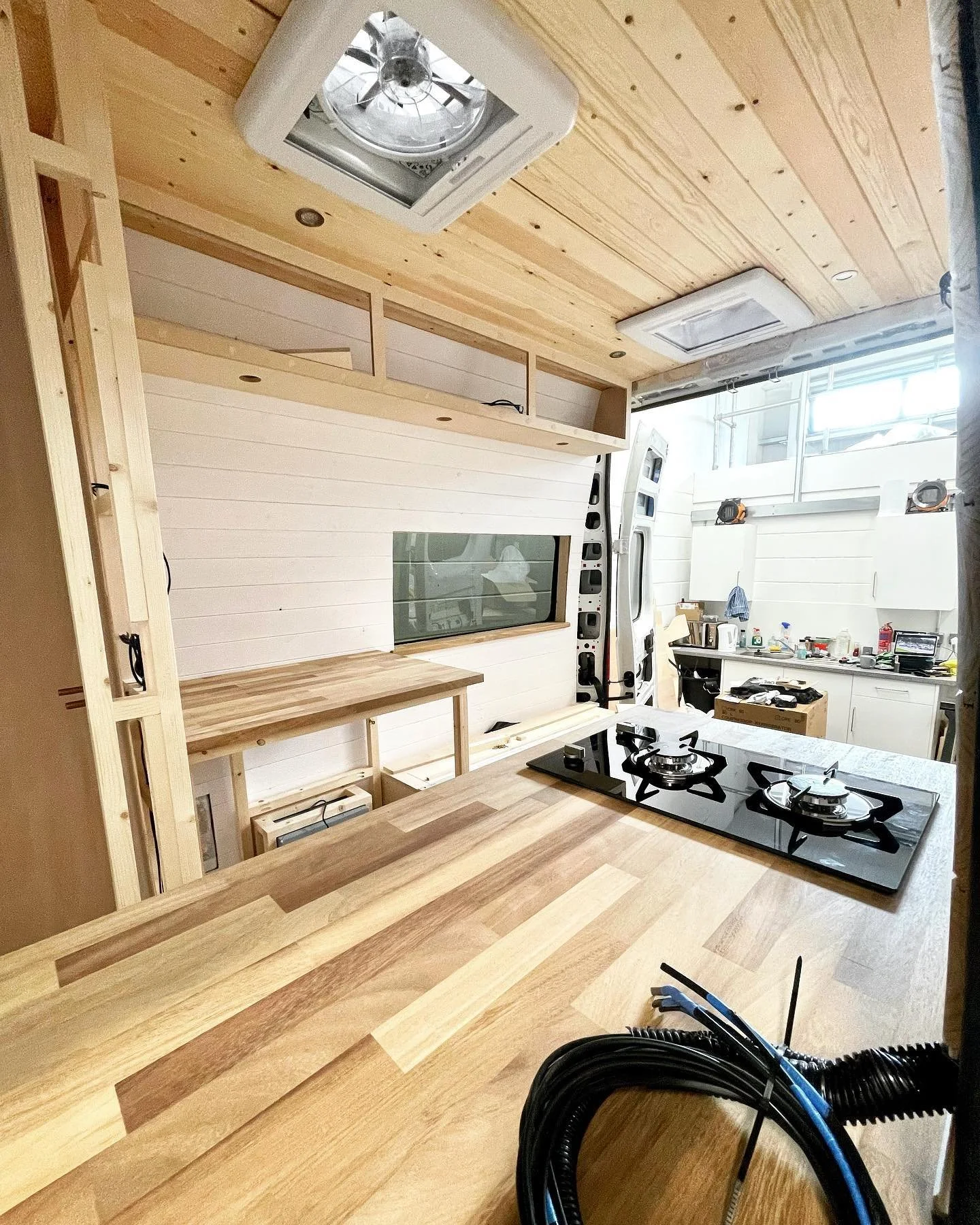
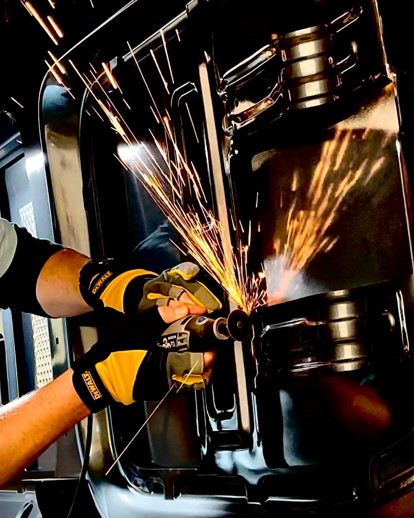
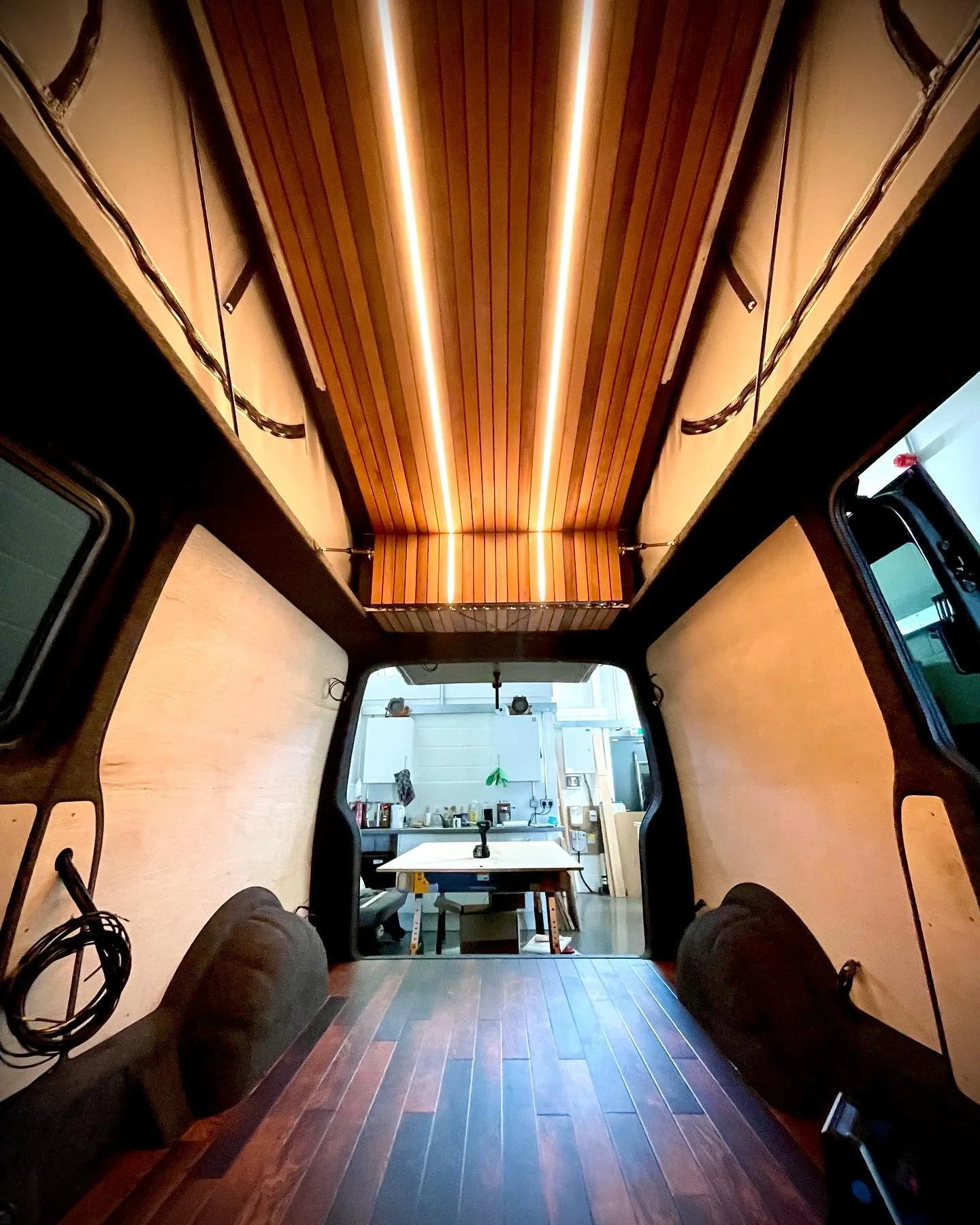
Jack Hayward builds meticulously crafted campervans for discerning clients who want something a bit special.
"Extraordinary, individual"
With Jack's background in tech, design, and craft, the brief played to all of my strengths and values — balancing rugged functionality with refined aesthetics.
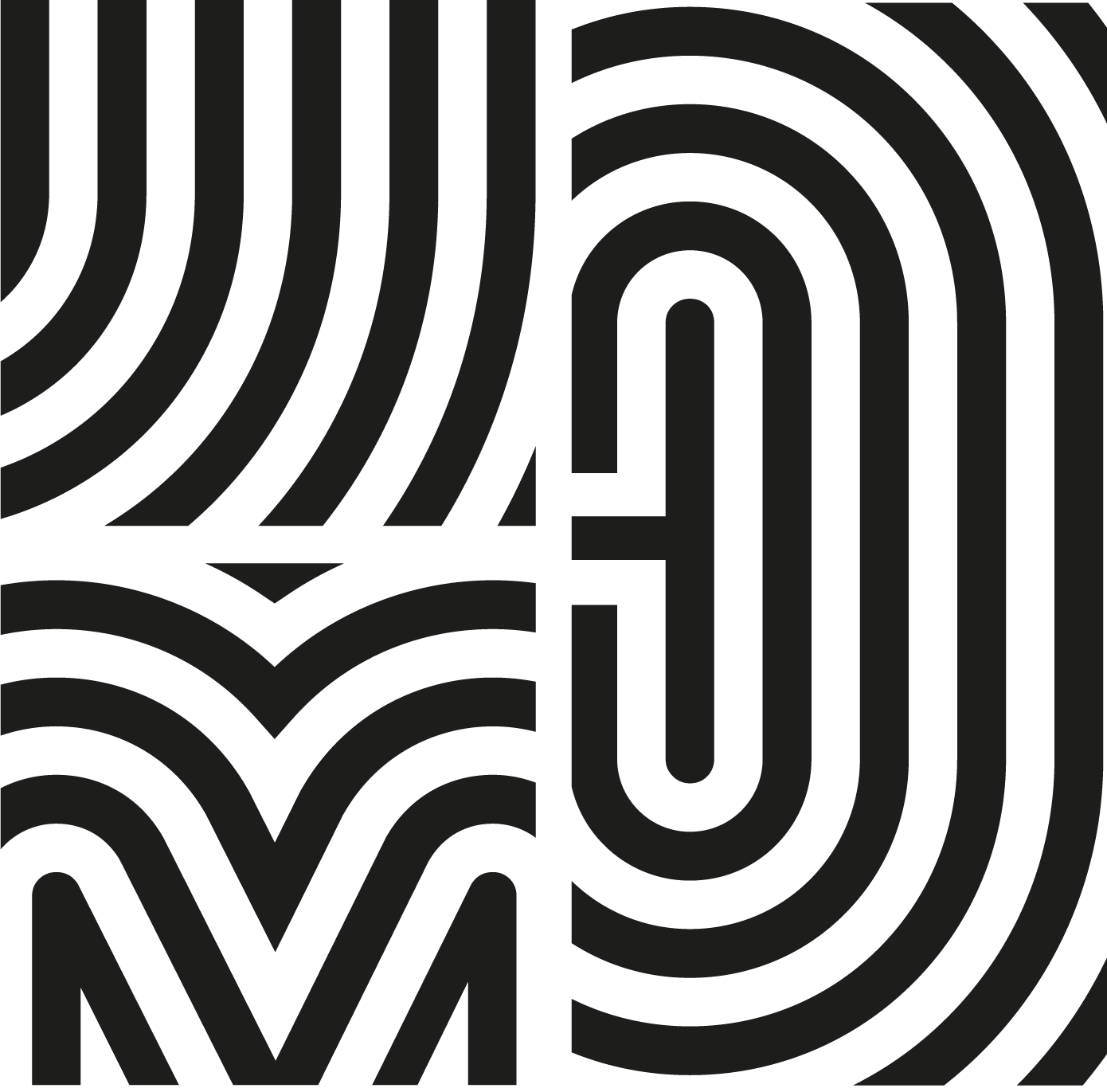
The logo needed to incorporate his monogram, JMH, without becoming traditional or stuffy. Fitting in, while subtly standing out in an IYKYK way, with the vanlife community.
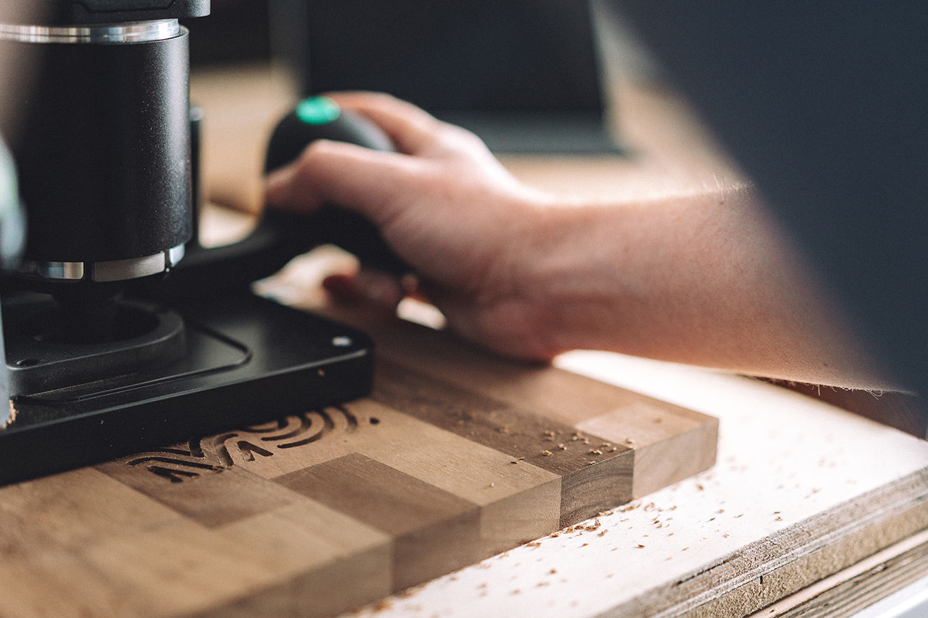
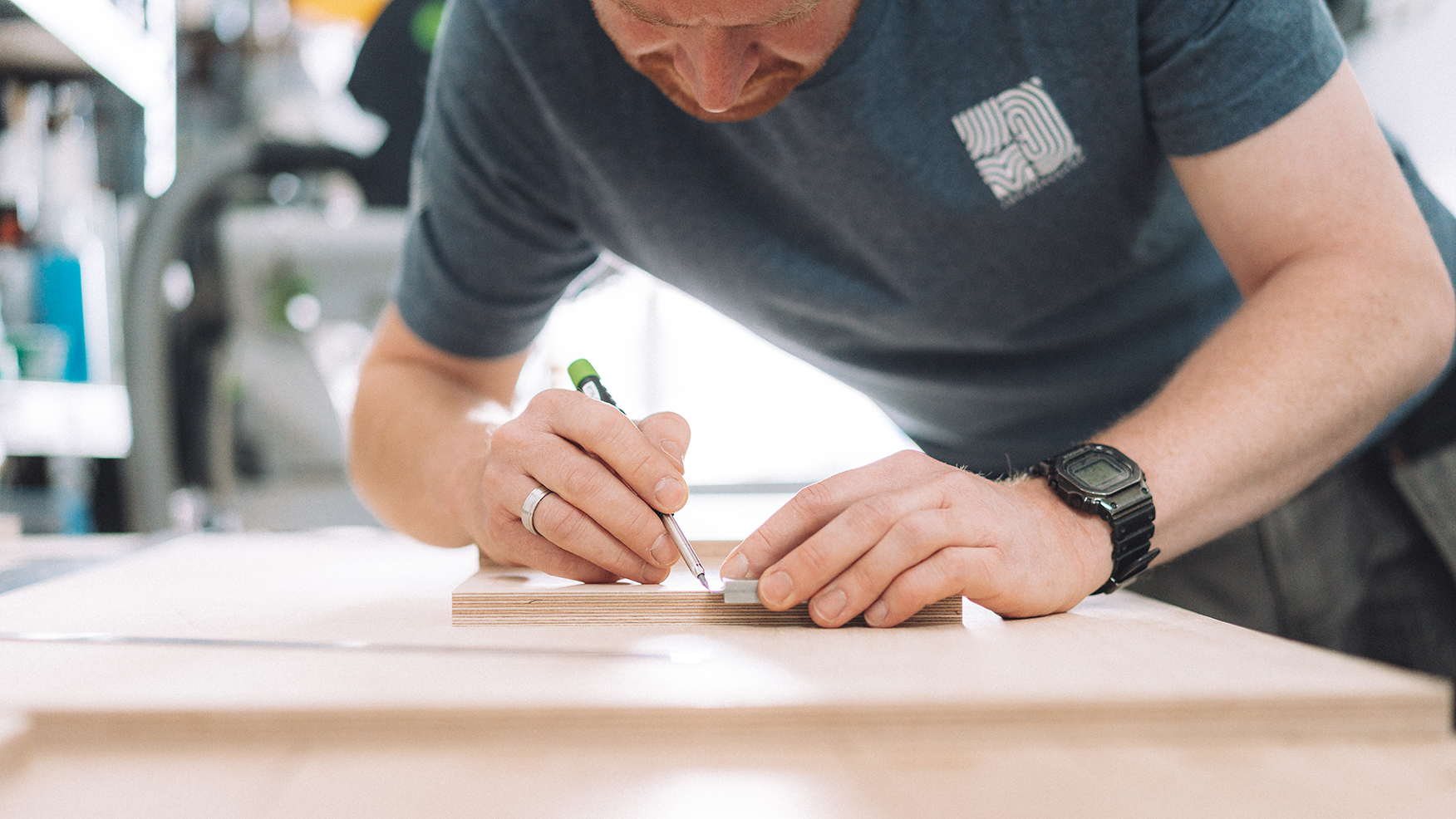
We knew that the identity would be incorporated into the physical world as much — in fact more than — the digital. This was an interesting challenge: figuring out how it would be physically fabricated rather than simply if it reproduced well at small scale on screen.
The goal was a marque that was as distinctive as it was intriguing. That felt strangely digital, like a QR code, yet could equally be applied as a literal brand via hot metal onto wood or leather.
The final design blends the JMH monogram with a suggestion of fingerprints — representing both the individual and the idea of hand-made craft — held together in a rational square similar to a Japanese Inkan seal.
Seeing it applied into the physical world has been a joy I'd almost forgotten — a reminder of why this work matters.
Follow Jack on Instagram to keep up with his builds.