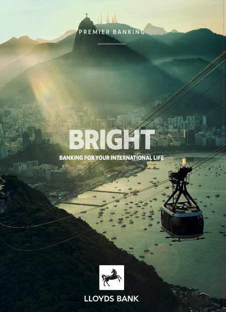
Global rebrand
Government legislation forced LloydsTSB to downsize significantly. TSB was reformed as a standalone bank. Lloyds became Lloyds Bank once more — and needed a rebrand to match.
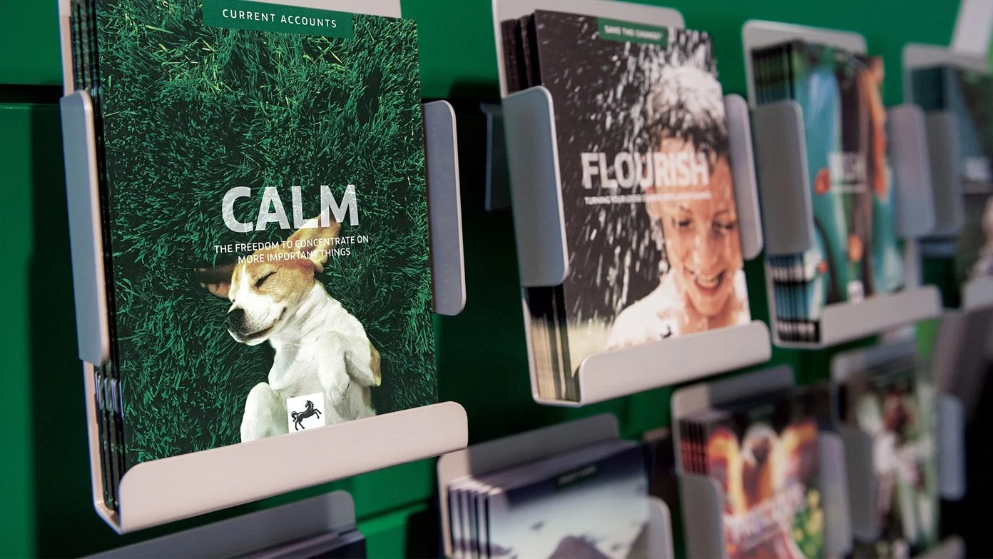
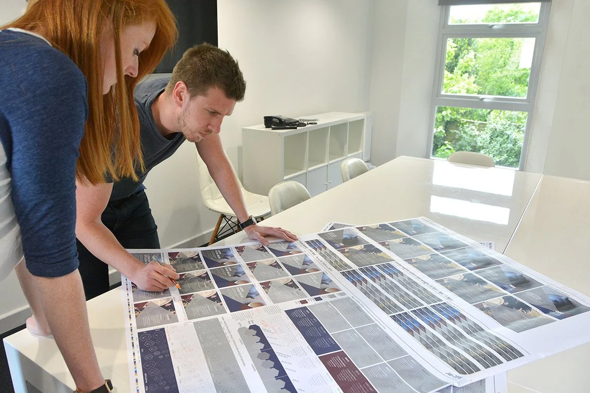
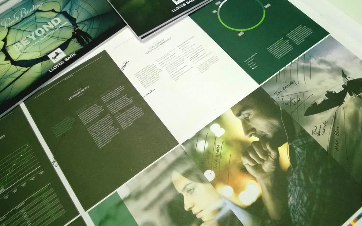
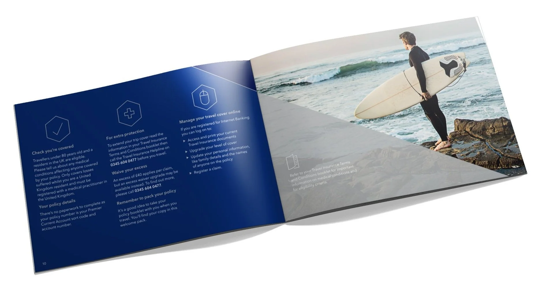
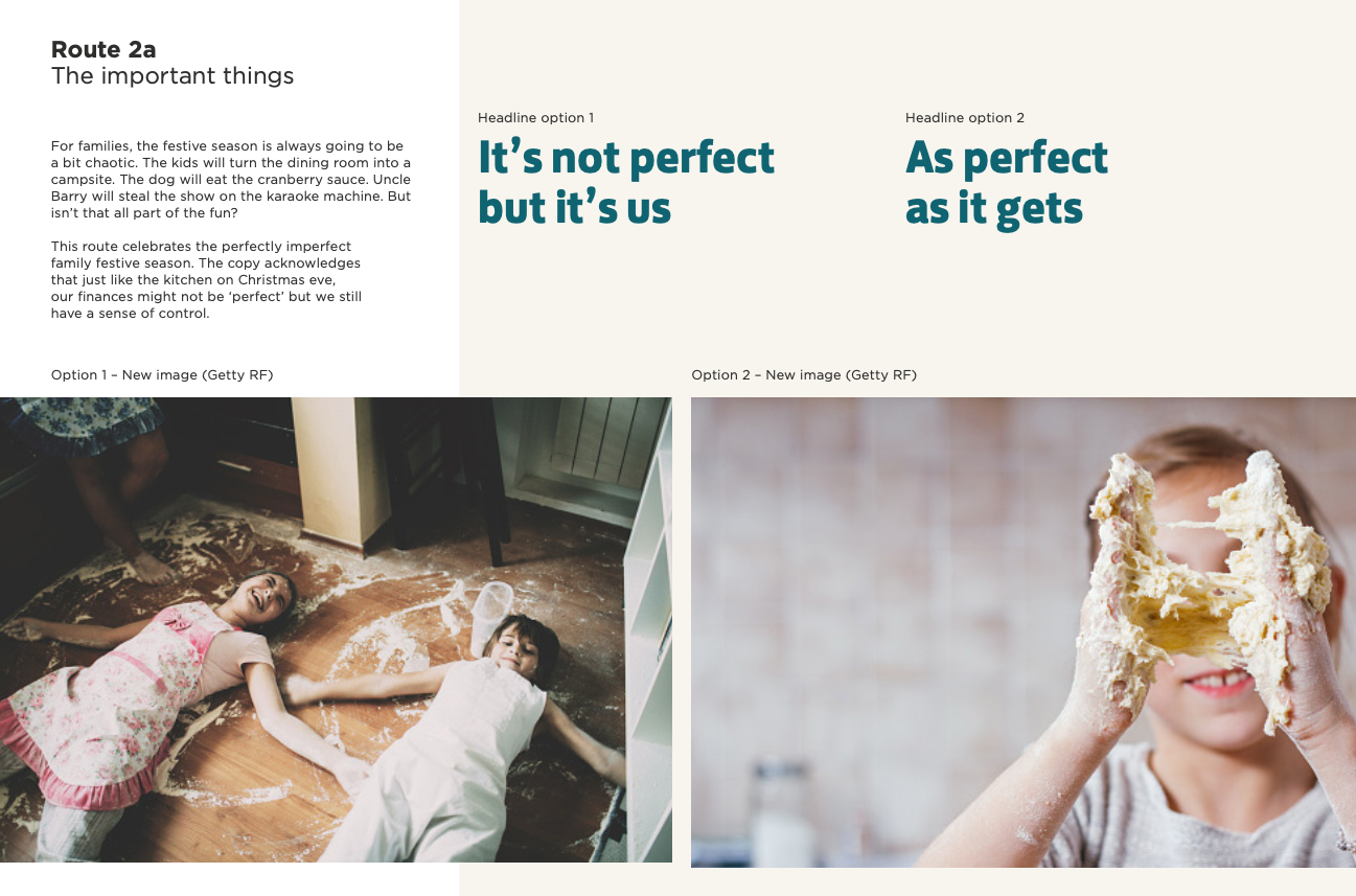
I was tasked with design direction for all below-the-line print collateral, including sourcing over 1,000 images. The project was a collaboration between Rufus Leonard, RaineyKelly, ProximityLondon, Adam&EveDDB — and us.
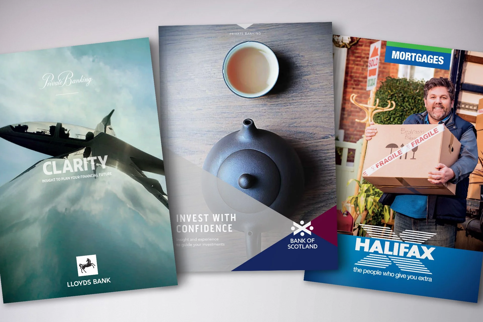
Lloyds Banking Group also comprised Bank of Scotland and Halifax, so it was seen as an opportunity to refresh all three brands simultaneously — a project that tripled the size of my team over a 12-month period.
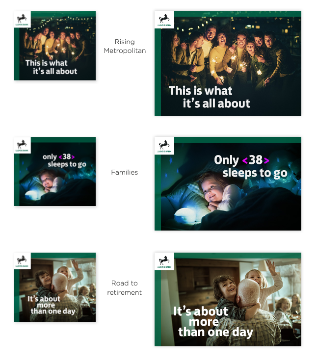
As design director, I led my team to source imagery and define the art direction, test and spec colours including metallic specials, finalise typographic details, and create a suite of icons — all while developing tone of voice in conjunction with the other agencies and writing content for the new material.
"It tested just about every string in a creative's bow."
It was a hugely successful collaboration among agencies — one I've never experienced quite the same way since. I'd worked on the old LloydsTSB characters previously, which I was sorry to see go. And now Lloyds have rebranded again, and honestly look better than ever.
Completed while at Six · In collaboration with Rufus Leonard, RaineyKelly, ProximityLondon and Adam&EveDDB